Creating Abstract, Textured Studio Backdrops
While I love my seamless, sometimes I wish there were another option in the studio than flat colour. Sometimes I feel like a subject, particularly one simply lit, would have a little more depth if the background had some texture to it, something for the light to “catch” on and “anchor” the image in something real.
Usually this is achieved by shooting on location, particularly with a shallow depth of field. It can be achieved by lighting the background through a gobo, throwing patterned light on the background. But none of this quite achieves either the right level of reality, or the right level of texture uniformity and colour/tone control required for the shots I envisage. While they both have their uses, there just isn’t anything like a proper backdrop to blend “real” and “fake” in the right quantities.
So, how to create the right backdrop? Be warned: I go into detail… This is 2800 words of research and experimentation. You might wanna skim from section to section.
Painted Backdrops
Enter the painted backdrop. More specifically, fine-art painted backdrops; those painted according to very specific criteria with some degree of skill for a fairly specific spectrum of purpose. These can include scenery, skies, abstract or even full-blown Hollywood matte paintings. Not those generic printed school-portrait backgrounds!

The real deal. Gorgeous? Yes. Worth the cost? If you can afford it, totally. I now know first hand how much work goes into this.
My inspiration here is, perhaps entirely unsurprisingly to some, Oliphant Backdrops, a small company producing fine art backdrops for high end clients from Hollywood studios to Vogue that are consistently beautiful and inspiring. I Googled the prices on these, and found a couple of forum discussions between previous clients placing custom work in the low four-figure range and rentals in mid-three-figures. Firmly out of my budget levels for the near future.
Naturally, my immediate instinct is to DIY instead. So what’s required to set about that? I spent a month working on that very question, so I could show you…
Getting Started
To clarify, I don’t have a fine art degree or anything along those lines, so I’m not approaching it with any significantly greater degree of skill with a physical paintbrush than anyone else. Given this fact, nothing I produce will likely ever be as good as an Oliphant without years of regular practice. On the other hand, I have a decent idea of how paint works, and I have some muscle memory from digital painting, so it shouldn’t be impossible. I’m aiming for it to be achievable by anyone with a modicum of artistic inclination like me, so my lack of experience is important. Anyone can follow along!

If you saw my blog recently, you’ll know I just dusted these 2012 paintings off after some time in an old backup archive.
First you have to figure out what you’re looking to create. Personally I’m not looking for anything too extravagant, my favourites are the abstract ones which vary between “cloud-like” and “shoddily-painted decaying plaster”. They strike the exact right balance between block-tone uniformity and reality-grounding detail for my aesthetic taste, so that’s the style I’m specifically looking at for this project.

The labelled Valspar 4000 base is the “Jet Black”. The “Cover & Go” is the flat white base.
For the paint, I’m using regular household flat latex paint. This is water-based, so it can be watered down (with some patience) and I don’t have to get thinner as well. To do this, I got primerless (so each layer isn’t actually two) white base and Lowes’ version of Pantone Jet Black, which actually consisted of a beautiful slate blue-grey. Perfect to pop skin tones off of. My other initial choice would have been a deep emerald green. A couple of different paintbrushes, rollers, etc. and you’re good to go!

Don’t forget you’ll need other bits and pieces; rolling trays and rollers, brushes, mixing containers…
Practice!
Before blowing through a load of expensive fabric, it’s a good idea to practice your brush- and roller-work on paper. I started on regular plain printer paper, just figuring out brushstrokes, mixing and thinning in varying amounts until I felt I was really getting somewhere.

First attempt… Pretty bad. But educational. Just keep learning at every stage.
It’s difficult to describe this aspect of the process, because it really depends on your level of comfort and skill. You may not feel ready to move on until you’ve laid paint down maybe 20 or 30 times, or you might just knock out a couple sheets that confirm that you’re good to go.

After a few more papers like these, I realised what I was supposed to be doing and honed my technique
I’m showing my progress throughout so you have an idea of what you’re aiming for, and where I started given zero recent experience painting either physically or digitally.
Once I was feeling ok with the look of the small stuff, I needed to see how the stroke sizes translated on a larger surface. Snipping off a section of my old 4-foot seamless, I laid it out and set to. Whilst this individual test worked out ok, this was the point where things generally got a little less easy, and I realised that canvas was going to be the only way to proceed.

Since I knew the final result was going to be pretty big, I practiced on bigger paper too.
Moving to Fabric
The paper is pretty much impossible to manipulate whilst wet, and takes damage extremely easily. Fabric doesn’t care much whether it’s wet or dry, it’s just as tough. Plus, while paper provides an adequate practice surface, it simply doesn’t take paint the same way as canvas, which is fairly critical to the look of the final product. Paper also provides no texture for the light to “catch” onto; it’s too smooth for a textured background and results in similar issues to seamless.

Quick test portrait I shot. The paper pattern is kinda distracting… It doesn’t soften up like canvas does.
To get canvas, I used reusable/washable painter’s dropcloths from Home Depot. The whole point of this project is to keep it reasonably priced, and given that paint is $10-15 a tin (for a gallon, anyway, which seemed like plenty to me) and drop cloths are around $15-25 depending on the size and canvas weight. A similarly sized primed artist’s canvas would be triple the price or more.
I found though, that even 8oz dropcloth canvas gets very heavy and stiff once painted a lot, so for ease rolling and using, it may be better to go with some kind of lightweight tight-weave linen or muslin.

I figured this would give me some practice options as well as a 8x4ft cyc for headshots
The 4x15ft dropcloth I got was cut into two 2ft squares, a 4ft square and the 8.5ft-ish remainder for the final product, which could theoretically be hung portrait or landscape depending on the application.

The first couple layers on the practice canvases drying
The first two squares were quick tests while I figured out how the canvas worked; it absorbs a lot more paint than paper, so prepare at least twice as much paint than your initial practice runs required. You’ll also find the paint pushes through the weave of the canvas, so make sure you have something down underneath to protect whatever surface you’re using unless it getting permanently painted doesn’t matter! I primed the squares with the white paint, a little thicker than I was using it the rest of the time so it would create a solid surface to work over.

Primed one, left the other plain. It didn’t seem to make a difference.
Application Techniques
Once you have your primed canvas (or unprimed, as I later used it… It didn’t seem to significantly affect the outcome), it’s time to start laying down some paint. The more layers, the better, I’ve found. Trying to achieve the aesthetic in just two or three layers doesn’t work. Patience is key, and give each layer plenty of time to dry (an hour for very thin, watery layers, maybe a couple hours or more for thicker “splodgy” layers.
You should be using the same techniques as you worked on earlier with the paper; I found they transferred just fine, merely the effect was slightly different. That’s a good thing, however, since we’re looking for the “canvas look” here. If you’ve got your brushes and paper to hand, but not sure where to start, I’ll go over some techniques that I’ve been working with.

Vertical brushing. A good place to start for a run-down wall look.
Brushing; specifically in the context of simply back and forth, linear strokes. This is, of course, the basic technique and is good for getting a lot of blocky colour down fast. Unless you have a really big brush, though, it’s not really ideal for larger surfaces. I tend to use the brush later in the process as a finishing tool. Dry brushing is the same, but with very limited amounts of paint on a brush that’s as dry as possible.

Rolling leaves sharp edges, but over a multitude of layers these start blending together and only occasionally showing through.
Rolling is ideal for getting started, putting down a thin layer of colour over a large area. Whether that’s priming or just filling in big blocks, rollers will lay it down quick. You can also use them for effect; those hard edges they leave can look good when used deliberately.

Spattering on the paper, I never left any deliberate spattering on the canvases, though I’m not ruling it out in future.
Spattering is subjective, some people love it, where others find it trite and dated. It’s easy to do though; just tap your paint brush against your other hand above the workpiece! I like the starry effect of white spattered on dark blue. You can do it more subtly too, with watered down paint, sliding your thumb down the bristles. This creates more of a sputtering-airbrush effect.

The four-footer, all cloudy and blended from stippling thinned paint.
Stippling, rapidly and randomly jabbing the dry brush bristles into the surface, is a technique I use a LOT. Probably too much, because I tend to find my designs a little too cloudy and blended-together. But if you want to soften edges, dry-brush stippling is fantastic. It’ll create clouds faster than you can blink though, so be sure you actually want to blend what you’re stippling before using this technique. Very lightly used (say, 2-4 “jabs”), it can create areas of textured detail, which could be left or dry-brushed over to distress.

Crosshatch, as a variation on the vertical brushing above. I tried both side by side.
Crosshatch is simply going in two perpendicular or almost-perpendicular directions. It works well when deliberately leaving roller edges visible like a “crummy warehouse paint job” or for distressed dry brushing. It can also help contain an area of colour you don’t want creeping over the surface too much, since it’s hard to get carried away with this technique. You can roughly crosshatch areas of different colours of slightly thinned paint onto wet canvas, then just keep it wet for an hour or so while it bleeds into itself, getting an attractive mottled appearance.

This was my scraper and how I loaded it. The effect was fantastic and can be seen later on.
Scraping is basically palette-knifing, like with oils and acrylics. It can create hard edges or raggedy scuffs, lay down texture or cover over it. It just depends on your angle, pressure and amount of paint. This is definitely one to experiment with on a small scale before you blow through a lot of paint, but I’ve seen it on a lot of my favourite Oliphant surfaces. You can use scrap wood, pieces of plastic packaging, paint scrapers, window wipers… Anything that’s fairly rigid and flat. This technique can also be combined with crosshatch brushing to dial back the crispness of it, if desired.
Thickness vs Toning
One last tip before I start wrapping up here! Remember that watering paint down and mixing it with other colours of paint aren’t the same thing. Sometimes one is more suitable than the other, or they can be used in conjunction.

Preparing my mid-tones. The blue went a lot further than the white, I hardly needed any.
Colour mixing is useful for both monochrome and multi-colour designs. In monochrome work, controlling the ratio of your darker and lighter colours creates a spectrum for you to use without having to always blend the paint right on the canvas, and creates a more subtle final look.
In multicolour designs, adding a little white, yellow or blue to the colour you’re working with, for example, produces an analogous colour scheme which contains rich detail whilst not being overpowering against the subject. Colour theory is important with backdrop work so make sure you’re read up on that before you try multicolour work.

Using thinned paint doesn’t just have to create clouds, but can also create brushed streaking like here. It looks good as an undercoat.
Watering down, or thinning, is controlling the opacity rather than the tone or hue. The more water you add, the less paint is contained in the same amount of liquid applied, so it gets paler and paler and thinner and thinner. This is generally best at the beginning, if you’re laying down clouds to start working over, or at the end, when you’re dialing in contrast levels and local tonality for the finished product. Latex household paint is what I chose because it can be watered down with just water, no “chemical” thinner required. Check the type of paint you’re using for what kind of thinning solvent it needs.
Finished Pieces and Example Shots
Now that I’ve covered as much theory and technique as I can in the space available, here’s what I came up with for my first round of canvases:

As first attempts on canvas, I can’t complain.
This was mainly cloudy. Painting on the back has given the front some interest, which is nice. Note how much the tungsten continuous lighting shifts the blue towards grey.

The first “final product”. Ironically this is the back, I preferred how it came out to the front!
Here’s what I came up with on round two on the back of those canvases. I feel it’s a significant improvement, and all I really did was add the scraping technique and improve the control of my brush strokes.

I tested a thinned mix on the left one, it was still too thick and it lost detail. On the right, You can see the result of blending dry brushing and scraping.

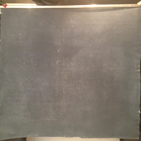
The “real” final product? I really like how this one came out, after 2 days and 16 layers. I may go for even more on the next one though, for even more subtlety.
Step-by-step progress shots on this last one were documented back in this post here: https://www.robtaylorcase.com/blog/2019/6/30/painted-studio-backdrop-mk-i-wip-sequence – you can see exactly how it comes together, layer by layer.
Final Thoughts
I discovered a few important lessons while working on this project to impart here. One, it’s harder work than it looks. It’s just as much a physical and emotional activity as shooting. This is because, two, it’s art. That is, it’s an artform in its own right- there’s a reason Oliphant specialise in just expensive backdrops, and don’t sell oil paintings and refinished furniture and a bunch of other stuff. Don’t expect to be brilliant immediately… But it’s definitely worth the effort put in.
Three; allow the chaos to flow, just try to channel it. Keeping abstract pieces (or even regular paintings, for that matter) under absolute control results in boring work. Like in photography, the happy accidents and weird effects are something you can run with or rework depending on your overall direction.
Four, regularly study the work of the masters. For me of course, this was Oliphant. I recently discovered another brand called Schmidli, which could be worth looking at for inspiration too. I realised towards the “end” that I’d missed several important techniques, so I started all over again and got far better results (which are already included in the above sections), and more enthusiastic about continuing the project into other sizes and colour schemes.
All for now! I’m hoping to revisit the question of backdrops in the future, and artificial environments- sets- in general.
~Rob
(PS. Editor’s note 2019: Glazing and faux finish techniques also come into play with this a lot more than I originally understood, and should form the basis of any future experimentation)