Painted Studio Backdrop Mk. I WIP Sequence!
After completing the how-to article for Phototuts, I still have a number of images and sequences to show from the month-long project. I wanted to show my most recent completion as a sort of how-to sequence, showing how I worked it and how the paint builds up over the layers.
It’s not yet perfect, but I’m pretty happy with it and it’s definitely a positive direction.
The couple layers brushed in, just like I did on a test piece which worked out well.

How I was applying the paint to brush/scrape

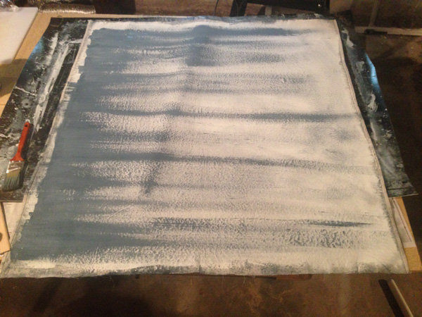
Continuing the linear brushing over the whole thing

I’m not thoroughly mixing the paints, so there’s always a little subtlety and variation going on. One lighter, one darker mix. I also use a lighter and darker again outside of these, so there are four mid-tones as well as the full “black” and white.
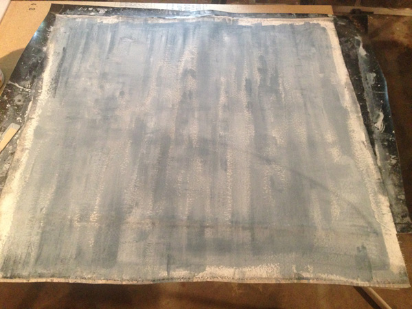
A whole bunch (maybe 8?) of layers in, finally approaching total coverage. No great rush.

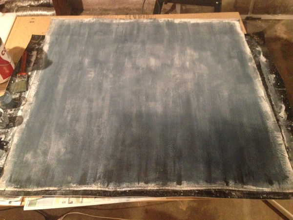
A couple more layers; total coverage reached and varying darker tones at the bottom for a sort of “water stained” look.

A bit more detail on the previous image.

Some dark dry brushing at the bottom, some lighter strokes in the middle. I’m starting to vignette it out at this point.

Going a bit nuts on the bottom, with more blending and texture. Some more crosshatch on the lighter stuff in the middle.

Adding some dark around the top and sides.

A thin wash over the whole thing to bring the contrast levels down a bit.

Moving the dark levels around on the left side.

Bringing them up even higher, the vignetting goes a little wrong here. No worries though.
Several layers later, getting the vignetting back under control and deliberately going for some “patchwork paint” effect.

Contrast levels more under control, bringing it overall more into the middle.


Roughing out the vignetting now that the overall “look” is pretty much done.

This is how the above image dries. Very thin layers, just keep buildin”em up. No rush.

Keep the paint thin enough that the visible tone is water darkening, but thick enough that it does actually leave a slight residue on the surface. You’ll have to experiment with ratios on a test piece prior to application to nail this.

The above, dried. Hard to go wrong with layers this thin.

The final product, white balanced. The canvas underneath it is the back of the 8×4. A little “vignette”. Would really need a couple 10x10s or bigger for this to work properly on shoots.
That’s the general gist, anyway! Dunno when the Phototuts article will publish, but I’ll link in the comments below and of course tweet it when it does.
~Rob